jint-methodology
JavaScript In The Nick Of Time
⚠️ This section is unfinished and unrefined. ⚠️
Examples and content will changed or removed without notice.
Order of Operations
JINT is structured into two phases. Please note that some minor details may be missing and there will be some hand-waving when it comes to functionality that’s defined by the HTML spec. In the following subsections, the terms server-side rendering and client-side rendering will be used when discussing when and where content should be rendered. These terms will be used within the context of dynamic content that’s fed by a model, typically from a database. Static elements such as a footer can be server-side rendered and shipped with every page. The goal of JINT is to load dynamic content in an optimized manner, not to ship an empty frame that lazy loads every HTML element.
Phase I
Phase one is structured around optimizing the initial page load. When thinking through how you’ll implement JINT consider how much data you’re queuing from the database along with what the impact of running your templating engine will be. Generally, anything above the fold that’s not behind a user interaction should be server-side rendered.
- An HTTP request is sent to the server
- Server receives request
- Query the minimal amount of data needed
- Server-side render the critical HTML elements
- Ship the lightest version of the document to the client
- The client receives the document
- HTML parsing begins
- Inline loading animations
<style>element is parsed by CSSOM - DOM parses the main application script element with
type="module"(modules are deferred by default) - DOM asynchronously requests the application script
- No more bytes are available to be parsed –
Documentobject created &loadevent is queued on the networking task source - Session history is updated
- Scripts are executed
- The
Documentbecomes visible to the user, loading animation is running - The main application script (hereinafter referred to as App) sets it’s state to
loading - The App collects all critical CSS filenames
- The App parses out any duplicate CSS filenames
- Dynamically generated
<link>elements with arel="stylesheet"attribute are generated for each CSS file - All
<link>elements receive aloadevent listener - All
<link>elements are appended to the documents<head> - All
<link>elementsloadevents have fired - App sets it’s state to
idling - Loading animation is hidden
Phase II
Phase two is structured around lazy loading functionality, non-critical content, client-side rendering, and persistent state management. Typically content that is rendered in phase two is hidden behind a user interaction or below the fold. Usually, data for the content below the fold will be fetched when the component becomes visible and the content will be client-side rendered when the data arrives. Depending on the type of content a loading animation or skeleton frame should be used. When components have several moving parts it can be helpful to display the loading bar as a progress bar informing the user how for along the loading process is. Phase two is split into two parts. Phase 2a loads all non-critical stylesheets and Phase 2b handles web components.
Phase II Part A - Stylesheets
- Collect all non-critical CSS filenames
- Purge duplicate filenames
- Dynamically generated
<link>elements with arel="stylesheet"attribute are generated for each CSS file - Verify for each
<link>that the stylesheet hasn’t already loaded – if it has don’t append the link - All
<link>elements receive aloadevent listener - All
<link>elements are appended to the documents<head> - All
<link>elementsloadevents have fired
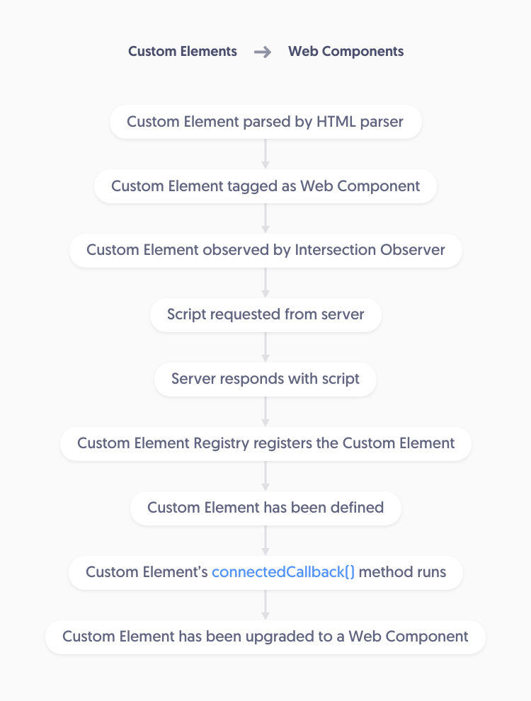
Phase II Part B - Web Components
- Collect all Custom Elements that will be upgraded into Web Components
- Observe all custom elements using the Intersection Observer API
- IO callback fired or web component is eager loaded
- Verify that IntersectionObserverEntry is intersecting
- Verify the web components script hasn’t already been loaded – if it has already loaded only unobserve the entry
- Dynamically generate a
<script>element with atype="module"attribute where thesrcattribute uses the web components filename - Attach a
loadevent listener to the script element - Append the script to the
<head> - Unobserve the entry
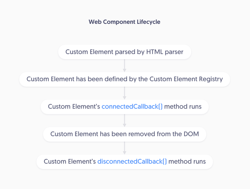
Custom Element to Web Component Upgrade Path
Web Component Life Cycle
Phase II Expanded
There are several ways to expand upon Phase 2 to enhance the user experience. For example, setting at custom state attribute on the custom elements that change from unseen to loading to mounted could then be used in CSS to manage how the web component appears. In the example below the component doesn’t show it’s button elements until the web component has been mounted.
custom-element
{
    &[state=mounted]
    {
        button
        {
            visibility: visible;
            opacity: 1;
        }
    }

    button
    {
        visibility: hidden;
        opacity: 0;
        transition: all 150ms ease;
    }
}
You could also create a system where the stylesheets for web components are not fetched until the components become visible.
What if I need actual critical CSS or JavaScript?
Write it inline. JINT is not here to restrict developer’s ability to craft the solution needed for their unique situation, it’s a general guideline.
If a script has to be loaded first and immediately for whatever reason, load it. Write the <script> tag and choose async, defer, or type="module" as needed. If you need to use a script that supports an older browser use the type="text/javascript" nomodule attributes.
If you need CSS before the initial paint write a <link> tag, or even a <style> tag. If it’s something minor such as setting a drawer to be transform: translateX(-100%) by default write an inline style using the style attribute.
If you add a <link> tag be sure to defer the CSS. In the example below the Google Fonts stylesheet is deferred with a no script fallback.
<link rel="preload" href="https://fonts.googleapis.com/css?family=Roboto:300,500,700&display=swap" as="style" onload="this.onload=null;this.rel='stylesheet'">
<noscript>
    <link rel="stylesheet" href="https://fonts.googleapis.com/css?family=Roboto:300,500,700&display=swap">
</noscript>
The Art of Communication
This section will cover the basics of how web components should communicate with one another along with information about how to utilize Web Workers.
Defining Controllers
A Controller is a piece of code that manipulates a Model and can manipulate a View but doesn’t have to. See MVC software design pattern for additional information.
What Is/Isn’t A Controller?
Web Components are controllers, Web Workers are controllers (without a view), the business logic functions on your web server are controllers.
A Modified Actor Model
Communication is handled by using a simplified version of the Actor Model. An Actor is a Controller that registers an inbox with the messaging system. Actors always have at least one inbox but can have more. Any Controller within the system can send a message to an Actor’s inbox.
Client-Side Rendering
This section will cover a few of available options for handling client-side rendering along with showcasing an example of when client-side rendering can be leveraged in order to reduce the number of database queries required on every page HTTP request.
Dynamically Generated Elements
The first available option is to manually create all the elements using document.createElement(). Typically this method is preferred when creating small one-time use elements such as a snackbar notification.
It could be used to generate a dialog modal depending on how dynamic the modal needs to be. When confirming a users action it’s possible to generate all the required elements, however, when a dialog modal is used/generated several times or used as an information modal it might be better to use the Template method (see below).
For our example, we’ll say that the user has a list of user accounts and we want to confirm their choice to delete the user. Since the confirmation modal doesn’t exist within any web component we’ll use a controller to generate, append, and remove the modals. Let’s also assume that there will be other instances within our application where we want to confirm a users action so we’ll design our controller to be dynamic and to generate dialog modals without a predefined context.
Click here to view the live demo of this example.
Side note: there are times where a web component could dynamically generate the elements. For example, if there was an interactive map filled with pins that need to open a modal that displays information about the pins location the modal shell could be generated by the web component instead of a controller. The modals shell could appear with a loading spinner and the ID of the pin could be retrieved from the click event then sent to the server. Once the server responds with the data the new elements are created and appended to the shell before the content is revealed.
Now, back to our primary example. Let’s define a controller that has a makeModal() method that takes a title, message, and an array of actions objects.
interface Modal
{
    title: string,
    message?: string,
    actions: Array<ModalAction>,
}

interface ModalAction
{
    label: string,
    callback: Function,
    classes: Array<string>,
}

class DialogModalMaker
{
    public makeModal(modalObject:Modal) : void
    {
        const modal = document.createElement('dialog-modal-container');

        const modalBackdrop = document.createElement('dialog-modal-backdrop');
        modalBackdrop.addEventListener('click', () => { modal.remove(); });
        modal.append(modalBackdrop);

        const dialogModal = document.createElement('dialog-modal');

        if (modalObject.title)
        {
            const title = document.createElement('h3');
            title.innerText = modalObject.title;
            dialogModal.append(title);
        }

        if (modalObject.message)
        {
            const message = document.createElement('p');
            message.innerText = modalObject.message;
            dialogModal.append(message);
        }

        if (modalObject.actions)
        {
            const actionsContainer = document.createElement('dialog-actions-wrapper');
            modalObject.actions.map((action:ModalAction) => {
                const button = document.createElement('button');
                button.innerText = action.label;
                button.classList.add(...action.classes);
                button.addEventListener('click', () => {
                    modal.remove();
                    action.callback();
                });
                actionsContainer.append(button);
            });
            dialogModal.append(actionsContainer);
        }

        modal.append(dialogModal);
        document.body.append(modal);
    }
}
export const modalMaker:DialogModalMaker = new DialogModalMaker();
Now that we have our controller defined let’s import the module and use the makeModal() method in a web component.
import { modalMaker } from './dialog-modal-maker.js';

class UserAccountComponent extends HTMLElement
{
    private promptDeleteDialog:EventListener = this.prompt.bind(this);

    private prompt() : void
    {
        modalMaker.makeModal({
            title: 'Confirm Account Deletion',
            message: 'Deleting a users account cannot be undone. Are you sure you want to delete this account?',
            actions: [
                {
                    label: 'close',
                    classes: ['-text', '-grey'],
                    callback: ()=>{}
                },
                {
                    label: 'delete',
                    classes: ['-solid', '-red'],
                    callback: this.deleteAccount.bind(this)
                }
            ]
        });
    }

    private deleteAccount() : void
    {
        /** Do account deletion logic */
    }

    connectedCallback()
    {
        const deleteButton = this.querySelector('button');
        deleteButton.addEventListener('click', this.promptDeleteDialog);
    }
}
customElements.define('user-account', UserAccountComponent);
With the example web component above we now have a web component that uses a controller to prompt the user by asking if they’re sure they want the account to be deleted. If they click the delete button and confirm the deletion the deleteAccount() method is called.
Content Template Element
The HTML Content Template <template> element is used to hold HTML that is not immediately rendered when the page is loaded. According to the HTML spec, the template element is used to hold HTML that will be used to declare a document fragment within a script. Query selectors can then be used to access the HTML elements within the fragment so the content can be populated before the fragment is appended to the DOM.
The template element is the preferred method for handling client-side rendering. The example below will showcase how the template element could be used to generate a call to action cards for a project’s blog.
Click here to view the live demo of this example.
<blog-cards-component>
    <blog-card-container></blog-card-container>
    <template>
        <blog-card>
            <a>
                <img>
                <h3></h3>
                <p></p>
                <button></button>
            </a>
        </blog-card>
    </template>
</blog-cards-component>
In the HTML above we define a blog card element that contains the cards container. This container is where all the cards that will be created will be appended to. It also contains the template HTML for the blog cards. During the rendering process the template element represents nothing so won’t affect the content layout and can be placed wherever it can be conveniently referenced. The <blog-cards-component> custom element will be upgraded to a web component using the following script.
interface BlogCard
{
    title: string,
    copy: string,
    img: {
        url: string,
        alt: string,
    },
    link: {
        text: string,
        url: string,
    },
}

class BlogCardsComponent extends HTMLElement
{
    private _template : HTMLTemplateElement;
    private _cardContainer : HTMLElement;

    constructor()
    {
        super();
        this._template = this.querySelector('template');
        this._cardContainer = this.querySelector('blog-card-container');
    }

    private generateBlogCards(data:Array<BlogCard>) : void
    {
        data.map((card) => {
            const node = document.importNode(this._template.content, true);
            const img = node.querySelector('img');
            const title = node.querySelector('h3');
            const copy = node.querySelector('p');
            const link = node.querySelector('a');
            const button = node.querySelector('button');

            img.src = card.img.url;
            img.alt = card.img.alt;
            title.innerText = card.title;
            copy.innerText = card.copy;
            link.href = card.link.url;
            button.innerText = card.link.text;

            this._cardContainer.append(node);
        });
    }
}
customElements.define('blog-cards-component', BlogCardsComponent);
The code above hand-waves some of the functionality such as: where does the card data come from, is there a loading animation/state, can the user infinitely scroll to view more cards, is there/should there be a load more button, etc. However, the script should give a general idea of how the template element can be leveraged to quickly render content on the client’s side.
JavaScript Templating Engines & UI Frameworks
If the content you need to render is so complex or dynamic that it would be difficult use the template element you should ask yourself why you’re not utilizing the server-side templating engine via an AJAX request. The default view of the section could be a loading spinner and when the section becomes visible an AJAX request is sent to the server. The server then renders the section and responds with the HTML to be injected.
If your project is using a headless CMS then a JavaScript templating engine might make sense, however, you might be better off choosing a fully featured UI Framework such as React, Angular, or Vue.